A Field Trip to See the New American Airlines Livery
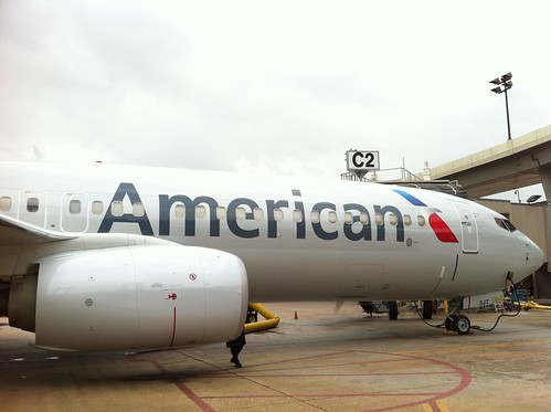
American Airlines has been touring their cornerstone markets with one of their new Boeing 737-800s painted with their new livery. So far they’ve visited New York and Miami, and today they came to Dallas to give the media, customers, and employees a chance to see the new logo and paint job in person.
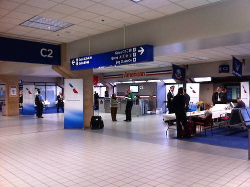
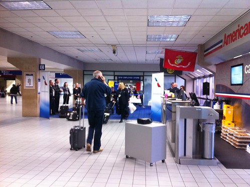
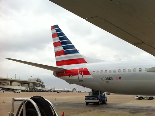
The Plane was parked at Terminal C Gate 2
Refreshments on hand to celebrate the event
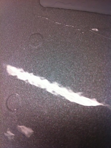
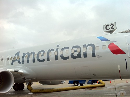
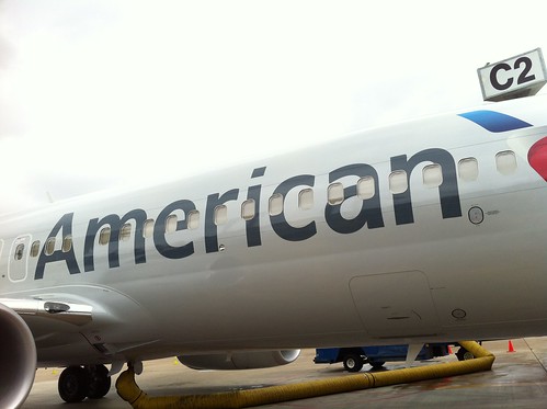
I got the chance to see it this morning and it looks great. The silver finish is so subtle that it’s hard to capture it with a camera. Here’s a closeup of the paint.
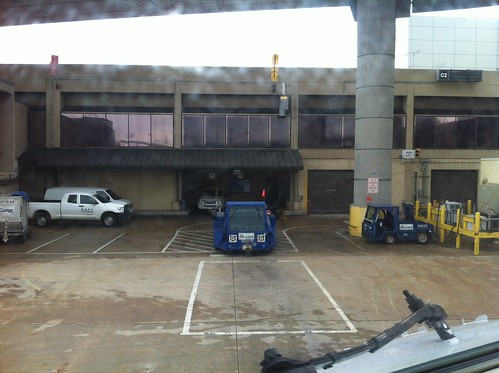
Here’s a view from the cockpit. This is what the Captain sees when he pulls up to the gate.
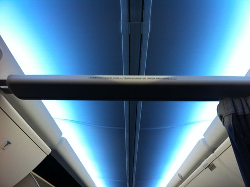
The 737-800 is equipped with the Boeing Sky Interior which uses lighting enhance the flight and to simulate an open sky overhead to create a sense of a larger space.
The lighting system is controlled by the flight attendants using a touch panel. Here’s what it looks like.
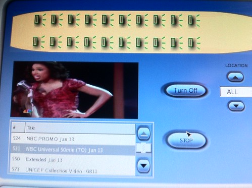
They 737-800 also has a panel that allow the flight attendants to control and view the inflight video.
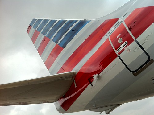
Up close the gradients and the paint finish on the tail have an almost liquid look.
Here’s the new American printed with the custom “American Sans” typeface.
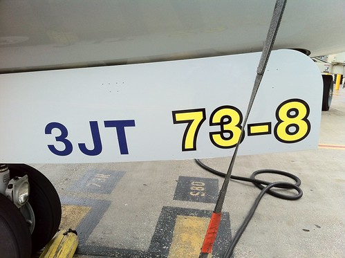
American will soon start taking delivery of 260 Airbus A320s, along with almost 200 Boeing 737-800s. Because the planes look so similar, they’re marking them so that ground crews will be able to easily identify them.
The next stop for the plane is Chicago (tomorrow) and then Los Angeles. If you’re traveling through either airports or out at DFW, keep an out out for it! Coming soon, the 777-300ER!!






I really don’t like the new paint job. It looks weird.
Great pics! The interior of the plane looks great. I really like the American Sans font but the tail is still not doing it for me.
Tail looks funny. Ok…we have a nice flag….but the flag on the tail looks horrible
@ Wendy – Wait till you see it in person, it looks a lot different than in photos. Thanks for the comment!
@ Michael W & Andrew – No doubt that most people either love or hate the tail, I haven’t talked to anyone that’s neutral about it. I guess it’s better to go bold! 🙂
I wonder how radical the old logo must have looked when it was introduced in 1968?
Looked at MSN headlines this morning and saw this article which mentions American Airlines new livery on the list of “Best and Worst Corporate Logo Changes” (see slide 7 of 12). Is the old logo better than the new? The debate continues…
http://money.msn.com/now/best-and-worst-corporate-logo-changes