Some interesting facts and trivia about American’s new logo and livery
I was traveling yesterday and noticed that the new logo is already starting to show up. The self service kiosks and the gate displays at DFW have a new look. Over the last few days I’ve collected several interesting items related to the rebranding with the idea that I might be able to use them in a post. That hasn’t happend, so I figured I’d just share them with you now.
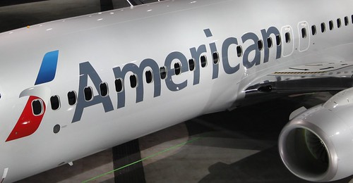
Silver paint
American is using a paint that contains mica to achieve a metallic finish with the new livery:
Silver mica paint was chosen as a way to maintain the silver heritage which American people and customers are passionate about, yet progress ahead with a clean new look.
The Scissor Eagle
The 1968 American Airlines logo created by the famous designer Massimo Vignelli didn’t include the iconic “Scissor Eagle”. In an interview with Bloomberg Businessweek about his reaction to the new logo, Vignelli said that he refused to design an eagle that didn’t have every feather.
He designed the double A, the red, white, and blue stripes, and the “American Airlines” script in Helvetica, but the office of Henry Dreyfuss did the eagle. For me, the “Scissor Eagle” was every bit as iconic as the rest of the branding, I always thought Vignelli designed both.
The new typeface
American has replaced Helvetica with a new custom typeface named ‘American Sans’, which is based on a font called ‘The Sans.’
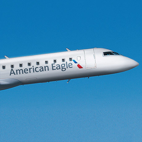
American Eagle Livery
Here’s a look at the new American Eagle Livery
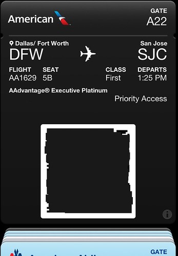
Mobile boarding pass
Here’s how the new mobile boarding pass looks in Apple’s Passbook
AAdvantage
Here’s the new AAdvantage logo
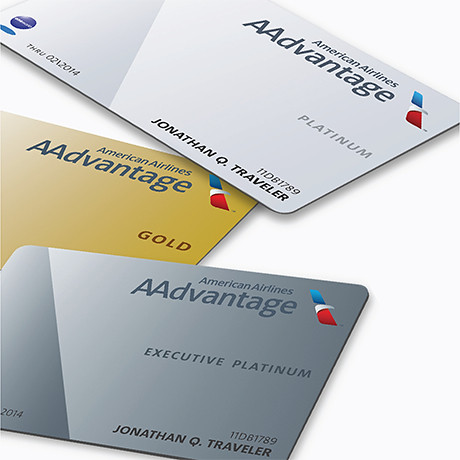
New AAdvantage Cards
Here are the new AAdvantage Elite cards
Hi-res photos
In many of the web resolution photos that I’ve seen, the paint almost looks white, sort of like a pearl finish. Click these photos to see a higher resolution version, you’ll be much better able to see the silver finish of the plane. The low res photos don’t really do the livery justice.


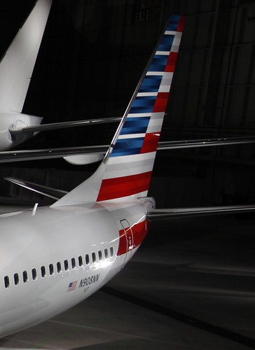
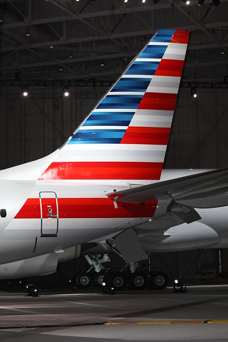
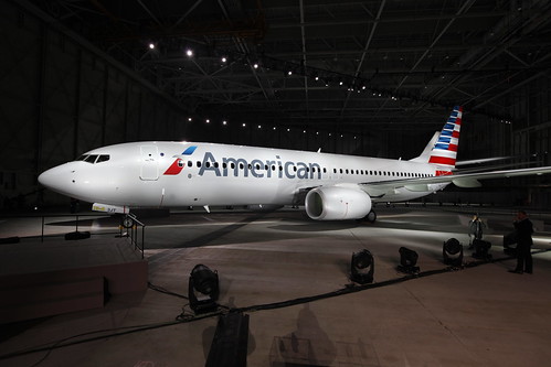
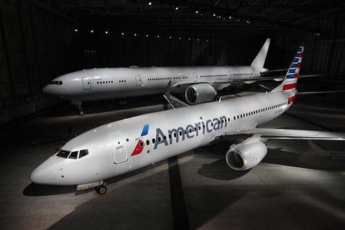
The more I see this, the more it grows on me…they have the kiosk rollouts done at ORD as well.
@ IPBrian – The old logo never looked old until I saw the new one. Now as I get used to the change, it looks less “radical”. I’m sure 40 years from now it will be as iconic as the one that it replaces. 🙂
@ Michael W Travels – I’m working on it. 🙂
I’ve been wondering- when are you changing the livery on your blog to match the new AA! 🙂