American Airlines redesigns their mobile website
I have a confession, it may be a little obsessive, but every morning I check my AAdvantage account balance and take a look at my AA reservations.
This usually happens on my iPhone while I’m standing in line at Starbuck’s, and this morning when I went to the AA.com mobile site while waiting on my Americano, I noticed that it had been completely redesigned.
Here’s a look.
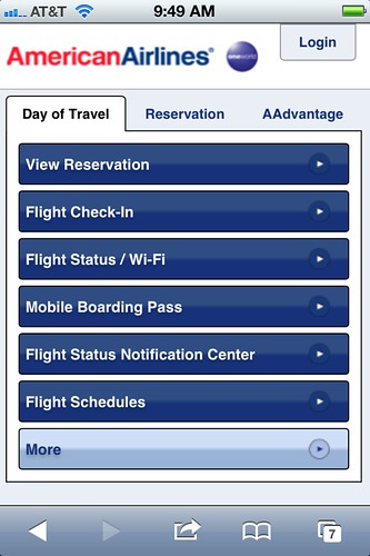
The new home page. Cleaner and with tabs to help you navigate with fewer clicks.
The new reservation page is much improved. On the old site the “Select” and “Cancel” links were small and too close together, making it easy to accidentally select the wrong action. The new site has buttons which make it much easier to select an option without making a mistake.
The new seat map. The old site didn’t display every row in one page, you had to navigate through two or three pages to see all the seats. This new site displays the whole seating map on a single page.
I like the new website. Take a look for yourself at mobile.aa.com and share you thoughts in the comments section.


Do they show the upgrade list? They really need this feature if not!
@ mike – Great question. I didn’t seen anything, but I don’t have a flight until next week, so I’m not sure how it displays when you’re within the upgrade window.
Thanks for asking. Maybe someone else can tell us?
Do you use the mobile app? Or go straight through your browser?
Why don’t you use the app?
@ Dan and John777 – I usually check my account balance while I’m reading through my RSS feeds and news headlines, so I use the website more frequently. Though when I’m traveling, I use the app exclusively.
How about you?
Great post! I need to check it out for my upcoming trip
@ Heather – Thanks!
I agree, much better GUI for the mobile site!
I’m so glad to know there are others out there that also obsess on checking account balances!
@ Rob – Glad I’m not the only one! 🙂