The American Airlines website gets a small update over the weekend
Unless scientists capture the Loch Ness Monster or discover an asteroid headed towards earth, the big story this week is going to be the Apple’s Tuesday press conference to unveil the iPhone 5. Way over on the other end of the news coverage spectrum is a small upgrade of the American Airlines website that happened over the weekend.
American has been rolling out updates of AA.com all year. Some of them have been cosmetic improvements to the look and design of the website, while others have been backend upgrades to allow them to add new service products such as Preferred Seats and paid PriorityAAccess. I guess the AA.com web team must have spent part of Friday night working, because Saturday when I went to the site to purchase a ticket for a reservation I had made on Friday, I noticed the reservation page had been redesigned.
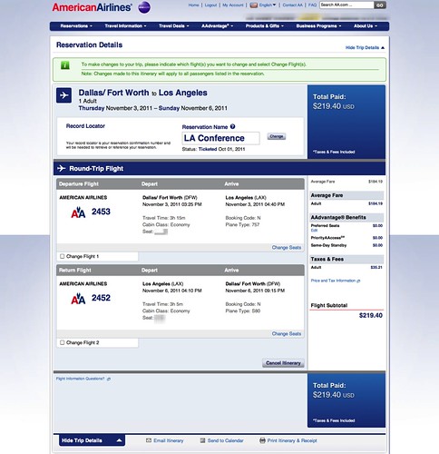
The most prominent new feature of the reservation page is the larger typeface.
Here’s a look at the the details section of the reservation page:
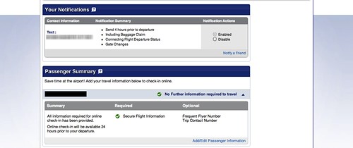
Here’s a screen capture of the notification profile section:
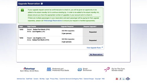
Here’s a screen capture of the upgrade request section:
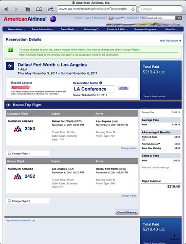
The thing that you don’t notice immediately though, is the flexibility of the new design. I took a look at the source code behind the new page and the AA.com web team designed it so that it looks good on multiple screen sizes and devices. It scales nicely on the desktop as well as iPads and tablets sized screens. Here’s how it looks on the iPad.
It’s funny how deeply attached people can be to a design once they become familiar with it, and I’m no different. At first I wasn’t sure if I liked the larger text. But after viewing the change a few times, I came to realize that it’s much easier for my aging eyes me to see. Now I don’t need my glasses to read it anymore; it’s like 1999 all over again!
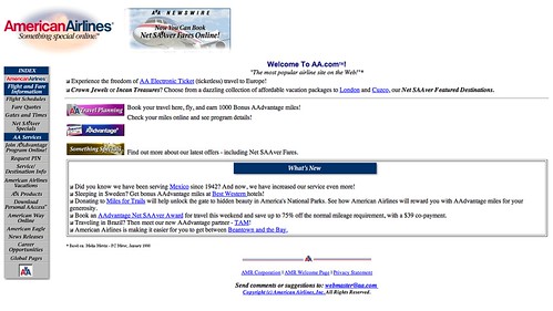
Speaking of 1999, just to show you how far the site has come, here’s a look at the home page via the Wayback Machine:
So what do you think? Do you like the new look?
Was that autocorrect that turned “notification” into “nonfiction”?
“Here’s a screen capture of the nonfiction profile section:”
@ TIm – Why yes, yes that was it…stupid autocorrect;-)