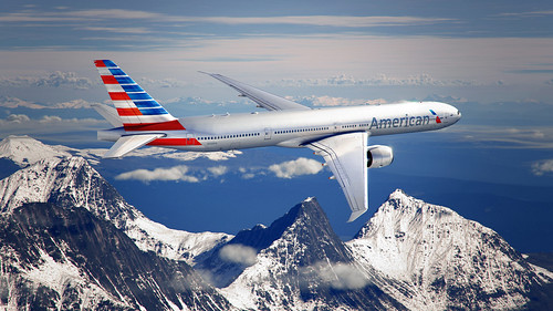
A behind the scenes video: American gets a new look and a new logo
American did a better job of keeping the new logo secret than Apple did with the iPhone! Finally, after many months of speculation and anticipation, the new look was introduced before an audience of American employees at DFW Hanger 2. The big event included a flyover from a 737-800 that was already painted with the new livery.
 |
| Photo Courtesy of FlightAware.com |
Here’s a look at the new logo and the new livery:
“Inspired by our proud past, our new look symbolizes our passion for progress by incorporating the colors and symbols you’ve come to associate with American.”
“Reflecting the soaring spirit that is uniquely American, our new logo — the Flight Symbol — contains the eagle, the star, the “A,” and refreshed shades of red, white and blue. Together, they represent a clean and modern update to the core icons of our company.”
Here’s a look at a behind the scenes video from the team that created the new branding look:
And here’s a commercial.
http://www.youtube.com/watch?v=oZ1tMaI9XMc
I’m glad that they kept the red, white, and blue colors and that they planes are still silver, even it it’s paint rather than polished metal. The scissor eagle is gone, that may take some time to get used to, but at least the eagle remains. I like the flag on the tail. I’m a big fan of the British Airways livery for incorporating the Union Jack on the tail, and I think it’s great that American will do the same with their own livery.
So what do you think? Do you like the new logo and livery?


i like the eagle logo a lot… and not sure why, but i’m not a fan of the new tail.
I’m not a big fan. This is going to take some getting used to!
Um, yeah the BA logo on the tail flows nicely. This is very poor and looks 3/4 finished from the side (needs another lower red bar at least). The tail should be the new eagle logo – wasn’t that obvious to them?
I like it!
Reminds me of this old Greyhound logo. They should have kept the ‘AA’ element. How does ‘AAdvantage’ make any sense now?
http://www.adapt.org/oldcontent/greyhound.htm