Is American going to announce the rebranding tomorrow?
American Airlines CEO Tom Horton sent out an email to employees today with this update:
our company will very quickly begin to look and feel very different – both inside and out. We will be sharing more information about the new look and feel very soon.
The complete text of the letter was posted by Terry Maxon on the Dallas Morning News Aviation Blog.
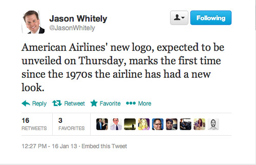
A short time ago Jason Whitely, a reporter with Dallas television station WFAA, tweeted this comment:
So what do you think? Will we see a new logo tomorrow?
A big hat tip to Destination David for spotting Jason Whitely’s tweet!

I really don’t care about their logo. I would just like better service. No amount of paint can cover over the bad flight I had a few months ago.
As much as we all hope so, somehow I think we will see pieces other than the logo. We already saw the transcon and international product offerings. Maybe tomorrow will be some sort of domestic offering change.
For what it’s worth, in the actual statement from Horton, the word “very” in “very soon” was in italics which may indicate it could be tomorrow or Friday and not weeks away.
I’d agree with Rosalie. The service on American Airlines is absolutely disgraceful and it is clear by the behavior of the employees that there is no respect for the brand, the company, nor its passengers. Unfortunately, AA is one of the default carriers mandated by my corporate travel policy. I usually brace before I have to suffer the journey with AA.
Thepointsguy.com has a story up already with potential images
@ Dave – I couldn’t escape from a meeting fast enough, but finally managed to fake a phone call and get something posted. Thanks for checking here for an update! 🙂
American definitely needs to improve the in-flight service. Flight attendants need to acknowledge their Elite passengers by the name not only in First, Business but also in the main cabin. As an Executive Advantage customer, I have seen it in most recent flights.
I really don’t care about American new logo. It is dull in color and absolutely not an eye catching.