American Airlines upgrades their website over the weekend.
Friday I received an email from American announcing their plans to launch a new look to aa.com. They went live last night just after midnight central time.
Here’s how they described the new look:
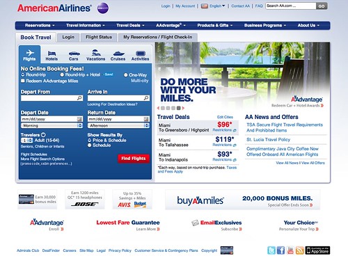
Next week, when you log on to AA.com, you will see your suggestions reflected in a major redesign that makes your favorite AA.com features more intuitive, smarter and easier to navigate.
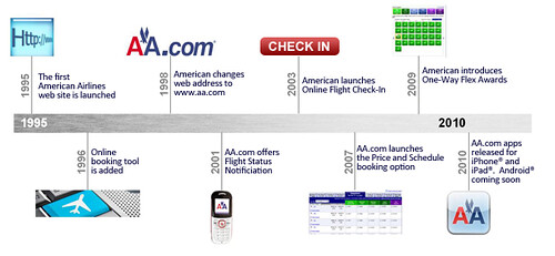
The new AA.com is just the latest in a long list of milestones we have achieved over the past 15 years aimed at improving your online experience.
Here’s a new look at the new home page:
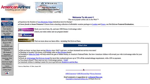
To see how far they’ve come, take a look at the original aa.com from 1998.
They left functionality in place and didn’t add anything new features. If you’re familiar with the way the old site worked, you’ll feel right at home with the new look: it’s mostly a visual refresh of the site, with less clutter, a larger typeface, and an emphasis on the sections that visitors use most.
I’ve been in the web design business for a long time, the company I work for does websites for Fortune 100 companies. In my experience, one of the biggest challenges with changing a site is that it forces long time users to relearn how to use the site.
Usually when a design team redesigns a site there’s the temptation to radically change functionality just because you can, and the decision to leave familiar functions in place takes some courage. When a company decides to redo a site, they’ll bring in mangers, designers, consultants, business analysts, engineers, and programmers, and it’s human nature to feel that in order to justify your budget and efforts, you have to make some radical changes in order prove you’re making progress. You won’t believe how difficult it can be to defend the decision to leave well enough alone when working on a redesign project and it can be very difficult to explain to a company’s executive team that you’ve spent all this time and money and that the best solution is to do the least. I applaud them for upgrading the look of the site without degrading ease of use.
My only criticism is that they didn’t bring back the flexible search feature, I wish they’d bring it back. Take a look at this video tour of the new aa.com and let me know what you think.